I thought I would show you just a few quick and easy ideas
that I used when creating my July sketch sample layout.
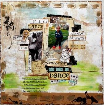
When I have an "outdoor" photo I sometimes like to enhance my background (no matter how busy that background paper might be) with some "sky" and "grass". I particularly like to do this when I have cropped in on the photo, changed it to black and white or have cut a silhouette, cutting out the background completely.
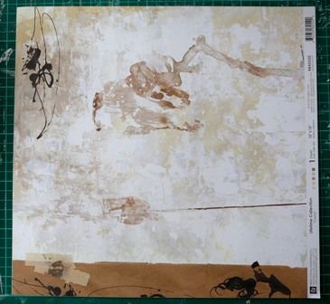
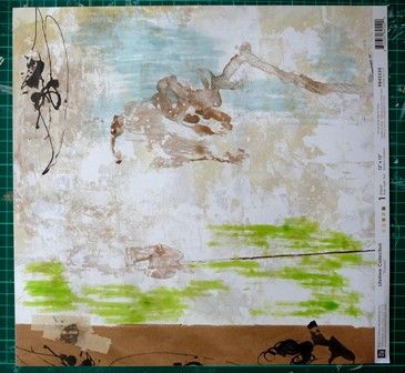
My base page Prima Lifetime Fasola + some weathered wood distress stain at the top and peeled paint distress stain on the bottom. You don't really need to worry too much about where the layout will end up, just add blue at the top and green at the bottom and you can always add in a little more later on when the layout is a bit more advanced. I sometimes give the stain a mist of water but not always.
On this photo matt, I didn't want the teacup so a lick of paint and another embellie and it's gone.
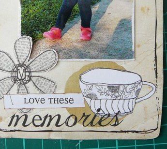
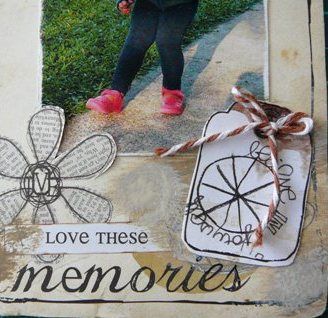
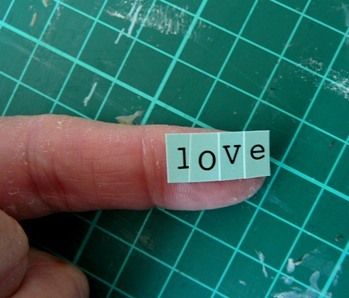
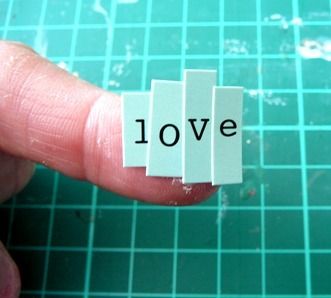
Now I just love these little alphas but sometimes the uneven lengths just don't always look right in a smaller space. So create the word, overlapping each letter (I pop them on my finger) and cut it off even. That would be the alphas not your finger. lol

When I have an "outdoor" photo I sometimes like to enhance my background (no matter how busy that background paper might be) with some "sky" and "grass". I particularly like to do this when I have cropped in on the photo, changed it to black and white or have cut a silhouette, cutting out the background completely.
My base page Prima Lifetime Fasola + some weathered wood distress stain at the top and peeled paint distress stain on the bottom. You don't really need to worry too much about where the layout will end up, just add blue at the top and green at the bottom and you can always add in a little more later on when the layout is a bit more advanced. I sometimes give the stain a mist of water but not always.


On this photo matt, I didn't want the teacup so a lick of paint and another embellie and it's gone.


Now I just love these little alphas but sometimes the uneven lengths just don't always look right in a smaller space. So create the word, overlapping each letter (I pop them on my finger) and cut it off even. That would be the alphas not your finger. lol
So some easy peasy ideas to achieve the look that you want. Looking forward to seeing what you all create for this month's sketch.
You can find the Sketch HERE

1 comment:
I love that you showed how you "fixed up" what you didn't like! Cool sketch. I'm still hoping to do some scrapbooking one of the days. Just need to clean off my desk!
Post a Comment